UI Components
NExS provides several UI components to enhance your apps: sliders for numeric input, LED indicators for status display, and buttons for actions and navigation.
Sliders
Sliders provide a visual way to input numeric values. They link to an editable cell and update it as users drag the slider.
Basic Slider
A slider needs two cell references: cell determines where the slider appears in your view, while linkedCell specifies which editable cell receives the value when users drag the handle.
| A | B | C | D | |
|---|---|---|---|---|
| 3 | slider | |||
| 4 | cell | B5 | ||
| 5 | linkedCell | C5 |
Slider Range
By default, sliders range from 0 to 10 in increments of 1. You can customize these bounds to match your data—a percentage slider might go from 0 to 100, while a quantity selector might use larger steps to keep the interaction snappy.
| A | B | C | D | |
|---|---|---|---|---|
| 3 | slider | |||
| 4 | cell | B5 | ||
| 5 | linkedCell | C5 | ||
| 6 | minimum | 0 | ||
| 7 | maximum | 100 | ||
| 8 | step | 5 |
Slider Styling
Sliders can be customized to match your app’s visual style. The color property sets the handle color using a hex value like #337ab7, while shape controls the handle appearance—choose from round (the default), square, or triangle.
| A | B | C | D | |
|---|---|---|---|---|
| 6 | color | #337ab7 | ||
| 7 | shape | round |
Global Slider Options
Set defaults for all sliders:
| A | B | C | D | |
|---|---|---|---|---|
| 1 | app | My App | ||
| 2 | sliderOptions | |||
| 3 | color | #28a745 | ||
| 4 | shape | square |
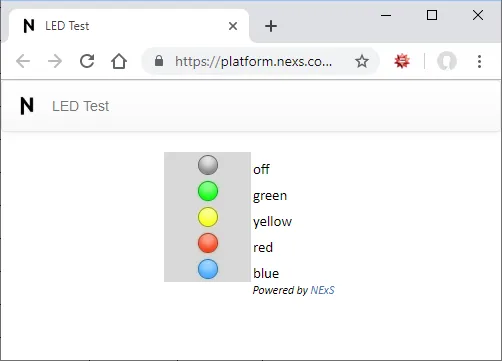
LED Status Lights
LED indicators provide at-a-glance status information—perfect for dashboards showing pass/fail states, system health, or alert levels. The LED’s color is controlled by the cell’s text value: red, green, yellow, or blue light up the corresponding color, while any other value displays a gray “off” state.
Basic LED
| A | B | C | D | |
|---|---|---|---|---|
| 3 | led | |||
| 4 | cell | D3 |
LED Sizing
| A | B | C | D | |
|---|---|---|---|---|
| 3 | led | |||
| 4 | cell | D3 | ||
| 5 | size | large |
Options: small, medium (default), large
Using LEDs with Formulas
Make LEDs dynamic by using formulas in the linked cell:
=IF(B5>100, "green", IF(B5>50, "yellow", "red"))This shows:
- Green when B5 > 100
- Yellow when B5 is 51-100
- Red when B5 ≤ 50
Global LED Options
| A | B | C | D | |
|---|---|---|---|---|
| 1 | app | My App | ||
| 2 | ledOptions | |||
| 3 | size | small |
Buttons
Buttons trigger actions when clicked. They can navigate between views, submit data, display alerts, or run custom JavaScript.
Basic Button
| A | B | C | |
|---|---|---|---|
| 3 | button | A10 |
Cell A10 becomes a clickable button. The cell’s content is the button label.
Multiple Buttons
| A | B | C | |
|---|---|---|---|
| 3 | buttons | A10, A12, C15:C17 |
Button Actions
Button actions are defined in the cell content using a special syntax: Label {action: parameters}
Navigate to Another View
Next Page {setView: 'Page 2'}
Set Input Values
Clear Form {setInputs: ['B3', '', 'B4', '', 'B5', '']}
Or clear a range: Reset {setInputs: ['B3:B10', '']}
Submit Data via Email
Submit {sendData: 'A1:C10'}
Sends the specified range to the email addresses in submitList.
Display an Alert
Done {alert: 'Your data has been saved!'}
With alert type: Error {alert: {type: 'fail', message: 'Please fill all required fields'}}
Types: success (default), info, warning, fail
Confirm Before Action
Delete {confirm: {prompt: 'Are you sure?', ok: {setInputs: ['A1:A10', '']}, cancel: {}}}
Combining Actions
Chain multiple actions together:
Submit {sendData: 'A1:C10', setInputs: ['A1:C10', ''], setView: 'Thank You'}
This sends data, clears the form, and navigates to a thank-you page.
Button Styling
Style buttons by appending a control object:
Click Me {bg: 'steelblue', fg: 'white', fontWeight: 'bold'}
Available properties:
bg— Background colorfg— Text colorfontWeight—normalorboldfontStyle—normaloritalicdisabled—trueto disable the buttonhidden—trueto hide the buttonextra— Custom data passed to event handlers
Dynamic Buttons with Formulas
Use Excel formulas to create dynamic button behavior:
="Submit {disabled: " & IF(A1="", "true", "false") & ", sendData: 'A1:C10'}"This disables the Submit button when A1 is empty.
Button Macros
NExS provides special macros for common patterns:
%CELL
References the button’s own cell address:
Select {setInputs: ['B1', %CELL]}
If this button is in cell A5, clicking it sets B1 to “A5”.
%REQUIRED
Evaluates to true if any required inputs are empty:
Submit {disabled: %REQUIRED, sendData: 'A1:C10'}
The button stays disabled until all required fields are filled.
Cell Locks (Advanced)
Open mode apps normally give each user an isolated instance, but sometimes you need shared state—like preventing two people from booking the same time slot. Cell locks solve this by providing a limited resource that app instances compete for.
Defining Cell Locks
Define a range of cells as locks in your app configuration. Each cell in the range becomes an independent lock that can be claimed by one user at a time.
| A | B | C | |
|---|---|---|---|
| 1 | app | Reservation System | |
| 2 | cell locks | Sheet2!A1:A20 |
Lock Actions
The getCellLock action attempts to claim a temporary 15-minute lock. You can specify what happens on success or failure—typically navigating to a confirmation form or showing an alert that the slot is taken.
Reserve {getCellLock: {cell: 'Sheet2!A1', success: {setView: 'Confirm'}, fail: {alert: 'Slot taken'}}}
Once a user completes their booking, confirmCellLock makes the reservation permanent. If they abandon the process, the temporary lock automatically releases after 15 minutes, making the slot available again.
Confirm {confirmCellLock: {cell: 'Sheet2!A1', permanent: true}}
Users can also explicitly release their lock with releaseCellLock if they change their mind.
Cancel {releaseCellLock: 'Sheet2!A1'}
Next Steps
- Inputs and Forms — Configure editable cells
- Deployment Modes — Control access to your app
- Events Reference — Handle button clicks in JavaScript