Charts
NExS supports interactive charts that automatically update when your data changes. This guide covers chart types, data formatting, and styling options.
Adding a Chart
Charts overlay a rectangular block of cells within your view. You specify where the chart appears (the cell range it covers) and where its data comes from (the source range). The chart automatically renders on top of those cells, so you can position it precisely within your layout.
| A | B | C | D | |
|---|---|---|---|---|
| 2 | view | Sheet1!A1:G18 | ||
| 3 | chart | A10:E18 | ||
| 4 | source | Sheet2!A1:D5 |
This configuration places a chart covering cells A10:E18, pulling its data from Sheet2.
Source Data Format
Your chart data should be organized like this:
| A | B | C | D | |
|---|---|---|---|---|
| 1 | Sales by Region [Revenue ($)] | |||
| 2 | Quarter | North | South | West |
| 3 | Q1 | 1200 | 3200 | 6300 |
| 4 | Q2 | 5100 | 1500 | 8320 |
| 5 | Q3 | 8000 | 2700 | 9010 |
- Row 1: Chart title, optionally followed by Y-axis label in brackets
[label] - Row 2: X-axis label (can be blank), then category labels
- Row 3+: Data point label, then values for each category
Example Output
This data produces a chart showing:
- Title: “Sales by Region”
- Y-axis label: “Revenue ($)”
- X-axis: Q1, Q2, Q3
- Three data series: North, South, West
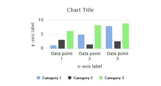
Chart Types
Specify the chart type with the type option:
| A | B | C | D | |
|---|---|---|---|---|
| 3 | chart | A10:E18 | ||
| 4 | source | Sheet2!A1:D5 | ||
| 5 | type | bar |
Available types:
| Type | Description |
|---|---|
column | Vertical bars (default) |
bar | Horizontal bars |
line | Line chart with markers |
area | Filled area below line |
pie | Circular pie chart |
stacked column | Stacked vertical bars |
stacked bar | Stacked horizontal bars |
stacked line | Stacked line chart |
stacked area | Stacked filled areas |
legend | Legend only (for linking) |
Pie Charts
Pie charts use a simpler data format since they show parts of a whole rather than multiple series over time. Each row after the title becomes a slice, with the first column providing the label and the second providing the value.
| A | B | |
|---|---|---|
| 1 | Market Share | |
| 2 | ||
| 3 | Product A | 45 |
| 4 | Product B | 30 |
| 5 | Product C | 25 |
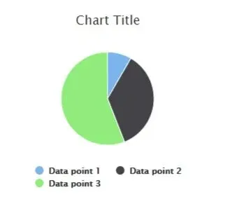
Chart Options
Sorting
Automatically sort the X-axis:
| A | B | C | D | |
|---|---|---|---|---|
| 5 | sort | ascending |
Or use descending to reverse the order. For stacked charts, sorting is based on the total of all stacked values.
Data Orientation
By default, each row after row 2 is a data point. To transpose (each row is a category):
| A | B | C | D | |
|---|---|---|---|---|
| 5 | orientation | column |
| A | B | C | D | |
|---|---|---|---|---|
| 1 | Sales [Revenue] | |||
| 2 | Region | Q1 | Q2 | Q3 |
| 3 | North | 1200 | 5100 | 8000 |
| 4 | South | 3200 | 1500 | 2700 |
| 5 | West | 6300 | 8320 | 9010 |
Show Additional Data
For stacked charts, display totals or percentages:
| A | B | C | D | |
|---|---|---|---|---|
| 5 | show | total |
Options: total (shows sum above each bar), percent (shows % on hover), or total, percent for both.
Y-Axis Range
NExS automatically scales the Y-axis to fit your data, but you can override this when you want consistent scales across charts or need to emphasize certain ranges. Setting explicit bounds ensures the chart doesn’t rescale unexpectedly as data changes.
| A | B | C | D | |
|---|---|---|---|---|
| 5 | yMin | 0 | ||
| 6 | yMax | 10000 |
Highlighting
Charts can highlight specific data points based on a cell value, creating interactive dashboards where selecting an item in one place emphasizes it in the chart. Point highlight at a cell, and when that cell’s value matches an X-axis label, that section lights up.
| A | B | C | D | |
|---|---|---|---|---|
| 5 | highlight | B2 |
Linking Charts
Multiple charts become more powerful when they interact. Linking charts creates coordinated behavior—clicking a pie slice highlights the corresponding data in linked bar charts, and clicking legend items toggles series visibility across all linked charts simultaneously.
| A | B | C | D | |
|---|---|---|---|---|
| 5 | linkTo | Chart2 |
Chart Styling
Color Palette
Customize colors for data series:
| A | B | C | D | |
|---|---|---|---|---|
| 5 | palette | #3366cc, #dc3912, #ff9900 |
You can use hex values or color names like steelblue, coral, gold. Colors repeat if you have more categories than colors.
Font Size
| A | B | C | D | |
|---|---|---|---|---|
| 5 | fontSize | medium |
Options: small, medium (default), large
Legend Position
| A | B | C | D | |
|---|---|---|---|---|
| 5 | legend | bottom |
Options: top, bottom (default), left, right, none (hide), or right, reversed for reversed order.
Background and Colors
| A | B | C | D | |
|---|---|---|---|---|
| 5 | backgroundColor | #f9f9f9 | ||
| 6 | alternateColor | #eeeeee | ||
| 7 | textColor | #333333 | ||
| 8 | highlightColor | #ffffe0 |
alternateColor— Alternating Y-axis bandstextColor— Titles, labels, tickshighlightColor— X-axis highlight color
Line Chart Options
| A | B | C | D | |
|---|---|---|---|---|
| 5 | markers | circle, square, diamond | ||
| 6 | markerSize | 6 | ||
| 7 | lineWidth | 3 | ||
| 8 | gradientFill | true |
markers— Shapes:circle,square,diamond,triangle,triangle-downmarkerSize— Size in pixels (0 = no markers)lineWidth— Line thickness (0 = no connecting lines)gradientFill— Gradient fill for area charts
Global Chart Options
Set defaults for all charts in the app section:
| A | B | C | D | |
|---|---|---|---|---|
| 1 | app | My Dashboard | ||
| 2 | chartOptions | |||
| 3 | palette | #3366cc, #dc3912, #ff9900 | ||
| 4 | fontSize | small | ||
| 5 | backgroundColor | white |
Individual chart settings override these defaults.
Complete Example
| A | B | C | D | |
|---|---|---|---|---|
| 1 | app | Sales Dashboard | ||
| 2 | chartOptions | |||
| 3 | palette | steelblue, coral, gold | ||
| 4 | fontSize | medium | ||
| 5 | view | Sheet1!A1:H20 | ||
| 6 | chart | A5:D15 | ||
| 7 | source | Data!A1:D6 | ||
| 8 | type | stacked column | ||
| 9 | show | total, percent | ||
| 10 | legend | right | ||
| 11 | chart | E5:H15 | ||
| 12 | source | Data!A1:D6 | ||
| 13 | type | pie | ||
| 14 | linkTo | chart1 |
Dynamic Charts
Because chart source ranges can contain Excel formulas, your charts become truly interactive. When users adjust input values, the underlying formulas recalculate, and the chart updates instantly to reflect the new data. Time-based formulas, VLOOKUP results, and conditional calculations all flow through to the visualization automatically. This reactive behavior makes NExS charts ideal for building dashboards that respond to user input in real time.
Next Steps
- UI Components — Add sliders, LEDs, and buttons
- Views and Layouts — Create dashboard layouts
- Examples: Sales Dashboard — Complete dashboard example